Inspirational Figures and Extracts
Empire Magazines are a very good and reliable source of honest reviews on all things film. It is a British film magazine published monthly by Bauer Media Group. From the first issue in July 1989, the magazine was edited by Barry McIlheney and published by Emap. Bauer purchased Emap Consumer Media in early 2008. It is the biggest selling film magazine in the United Kingdom and is also published in the United States, Australia, Turkey, Russia, Italy and Portugal. Empire organises the annual Empire Awards which were sponsored by Sony Ericsson, and from 2009 sponsored by Jameson. Empire publish reviews on films, games, television shows and some other things. The main aspect that appeals to me is their honesty and ability to be able to relate to their reviews.
As of their most recent edition, there have been over 150,000 hard copies and digital copies distributed. Empire's work is very closely related to one of our ancillary products. Empire have analysed almost all blockbuster films in the last 20 years and their special editions feature some of the most popular films of that year such as the one seen above. I used multiple music magazines as my influential figures for the product I created last year because of their success and fame. This year, I am using Empire and although I am using a magazine again, I do find this to be my stronger area and my work will heavily influence the ancillary task we have chosen.
In conclusion, again Empire will be the main source of inspiration for the ancillary product that we will be creating. We will follow a similar layout and writing style as Empire because they are an established company that know what they're doing through many years of experience. Using their products as a guideline but not following it completely is a good way to create a unique product that still feels professional.
As far as the other ancillary task goes, a film poster is much different to a magazine review and short film. The poster is a form of marketing and for this, we need to research into some famous figures known for marketing or successful marketing techniques in posters. From personal experiences, less is more. A poster that doesn't feel forced and crammed with subtle hints towards aspects in the film are often the best because it allows the audience to analyse it on their own terms and this builds suspension for the release date whereas a poster crammed full of different aspects can just feel overwhelming. This is also true for different genres, drama is much more minimalistic whereas action may be able to pull off a more 'hectic' poster.
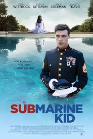
The poster for the film Submarine Kid is very effective. Partially because of the way the poster deceives you, when you see an image of a man in an Navy uniform with the title 'Submarine' you would expect a war film however the only war that is fought is between the person we see on the poster and his post traumatic stress disorder. This is an influential extract for me because of the way this is executed. Furthermore, the film was a success and the poster, as a part of the marketing campaign, was a success.


Comments
Post a Comment